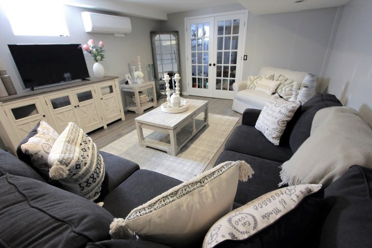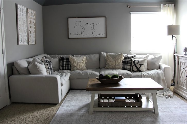


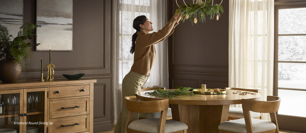
Key Takeaways
- Start with the furniture you plan to keep. Note its undertone, materials, shape, and visual weight before shopping.
- Choose a color relationship, tonal, complementary, or neutral with an accent, instead of trying to match every shade exactly.
- Repeat a wood tone or metal finish in a small detail when you want a mixed material to feel intentional.
- Measure the furniture arrangement before choosing a rug, art, or lamp; the right scale depends on how you use the room.
- Add texture first, then a few patterns that share a color. Leave useful surfaces and sight lines clear.
- Test colors in your own daylight and evening light. If you want to begin small, try one washable pillow cover in your chosen accent.
The answer to how to choose decor that matches your furniture is to coordinate, not copy. Begin with an existing piece that sets the tone for the room, observe its color, shape, finish, and scale, then choose home decor that relates to one or two of those qualities. A rug might pick up the warmth of a wood table without being brown; a curved lamp might soften a square sofa rather than mimic it. These connections make a room feel cohesive without making it look like a matching set.
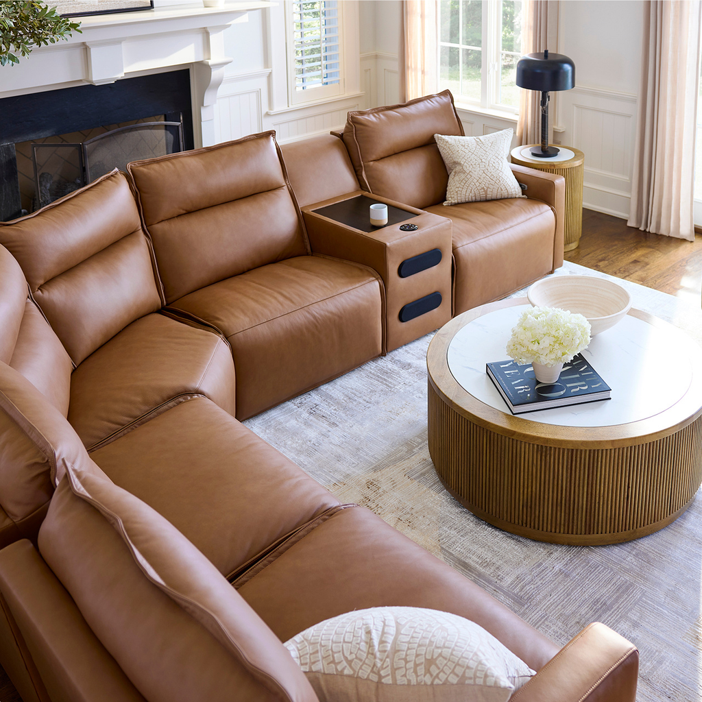
Start With the Furniture You Already Own
Choose the piece that has the greatest visual influence or that you are least likely to replace. It might be a sofa, bed, dining table, or large cabinet. If you have several contenders, start with the one that occupies the most space in your view from the doorway. You can still account for the others as you build the room palette.
Look at your anchor in the room, during the day and with the lights you normally use at night. Write down four observations:
- Color and undertone: Is the surface warm, cool, or fairly neutral? Gray upholstery can lean blue or green; brown wood can lean red or golden. Compare a fabric or finish sample with other colors in the room rather than trusting a product photo. A white sheet of paper beside the surface may make a subtle cast easier to notice.
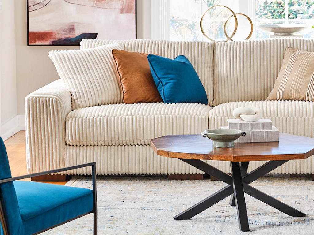
- Material and sheen: Is it matte linen, smooth leather, textured wood, reflective metal, or a combination? Contrasting textures can add depth, while repeating a material in a smaller accessory creates a connection.
- Shape: Are its lines mostly straight, rounded, tailored, or soft? This helps you decide whether the room needs an echo or a counterpoint.
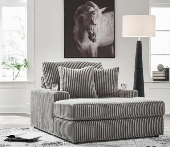
- Visual weight: A dark sectional with a deep seat looks heavier than an open-legged loveseat of similar width. Consider both its physical size and how much visual space it takes up.
You do not need every purchase to satisfy all four observations. If a pillow shares the sofa’s undertone, for instance, its contrasting texture may be what makes the pairing interesting. Use the observations as a filter for choices, not a requirement to assemble a set.
Choose a Color Relationship, Not an Exact Match
Pick a small palette before buying accessories: the anchor’s main color, one supporting neutral, and an accent. Include another color only if it has a job to do, such as connecting a patterned rug to existing art. The three approaches below offer different ways to make those colors work together.
Tonal: For a Quiet Room With Depth
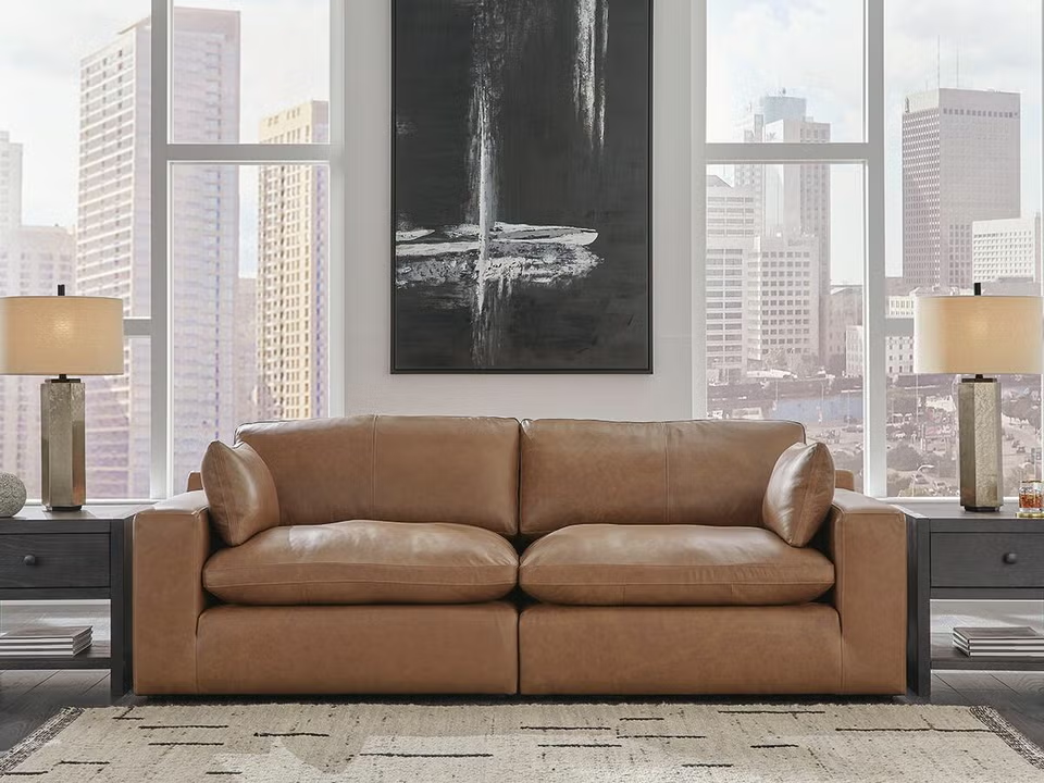
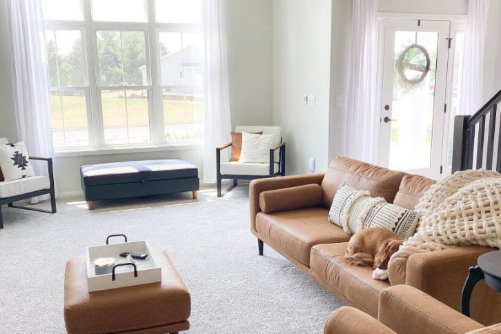
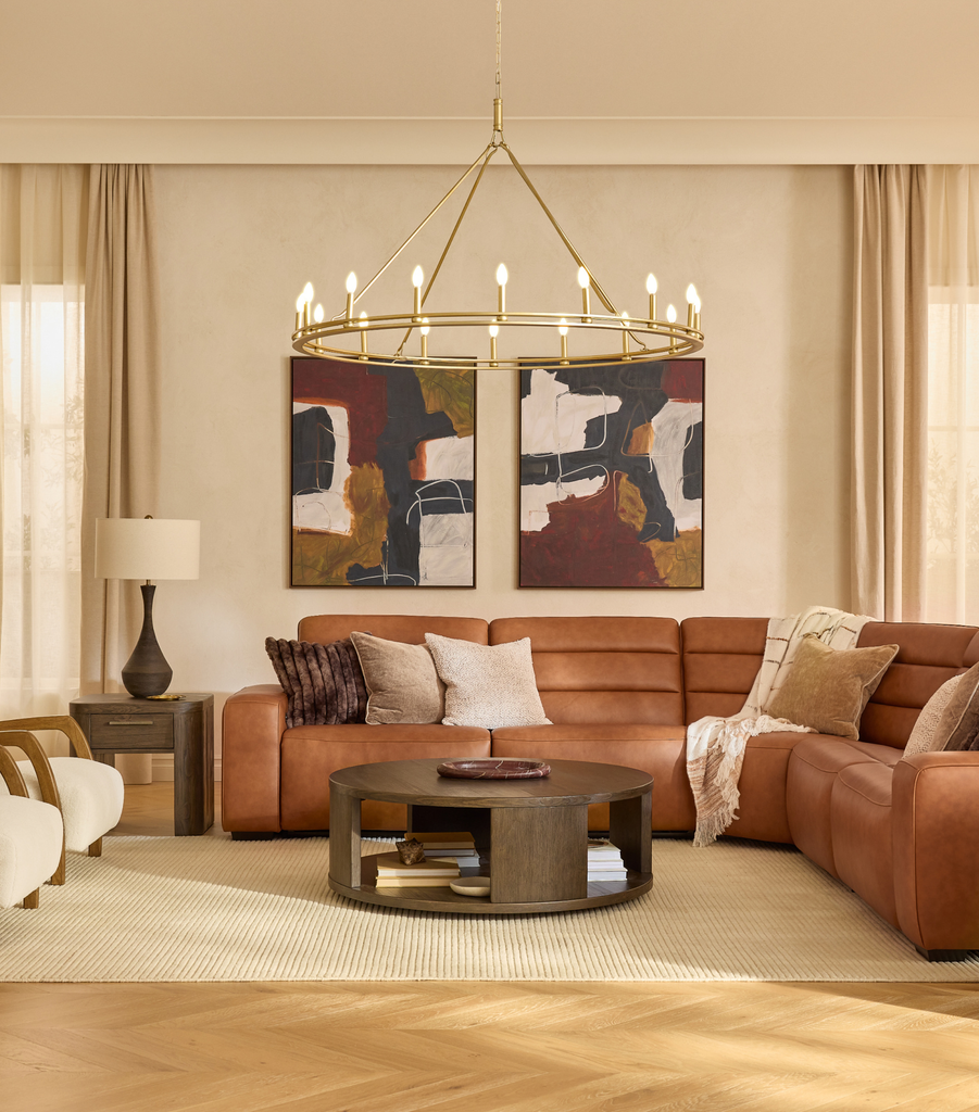
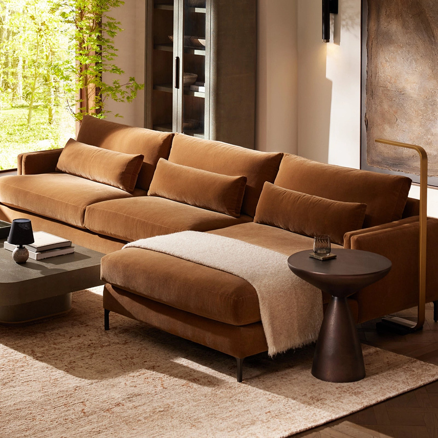
A tonal palette stays within one color family while varying lightness and saturation. With a camel sofa, you might use ivory curtains, a deeper brown frame, and a muted terracotta pillow. The colors need not be identical; their shared warmth is the link. This approach is useful when you like a calm room or already own several warm neutrals. Vary the surfaces, too, a smooth leather seat beside a woven throw keeps similar colors from blending into one flat area.
Complementary: For Controlled Contrast
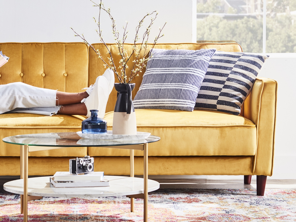
Complementary colors sit opposite each other on the color wheel. A navy sofa, for example, can work with a small amount of muted orange in art or pillows. The contrast gives a colorful anchor energy without requiring another large, saturated piece. This works best when the furniture is already a clear color and you want to emphasize it. You can soften the effect by choosing a muted version of the complement and letting neutrals occupy the larger surfaces.
Neutral With an Accent: For Flexibility
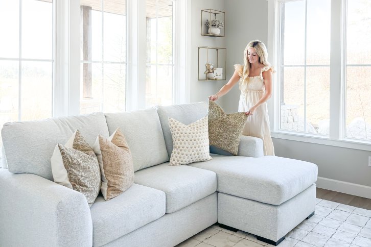
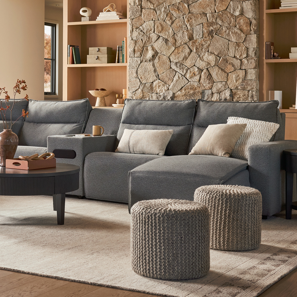
Let the existing furniture and larger textiles form a neutral base, then carry one accent through a few smaller pieces. A charcoal sofa might sit with cream curtains and a rug that includes touches of sage, echoed by a pillow. This approach is practical if you expect your tastes to change: swapping a cover or vase is simpler than replacing upholstery. Check the neutral’s undertone first, since a cool gray and a warm cream may need a shared color or texture to bridge them.
If you own a colorful sofa, resist buying accessories in exactly its shade. A rug with a smaller touch of that color, or art that combines it with your accent, will connect the room while allowing the sofa to remain the focal point.
Mix Wood Tones and Metal Finishes
Your decor does not need the same wood or metal finish as your furniture. Repetition can make an arrangement feel settled; contrast can keep it from feeling uniform. The useful question is whether someone can see why a new finish belongs in the room.
First, identify the finishes already present. A dining table may be warm walnut, while its chairs have black metal legs. That combination gives you two existing cues. You could echo the walnut in a frame and the black in a light fixture, then let a lighter wood tray add contrast. The repeated details connect the finishes without requiring every piece to match.
When mixing woods, compare actual samples when possible. Species names alone do not tell you how a stain will read: two items labeled oak can have different warmth and depth. Woods with similar undertones are often easy to combine, but a cool or pale wood can also work beside warm, dark furniture when there is enough separation for both to register. A neutral rug or wall behind them can provide that breathing room.
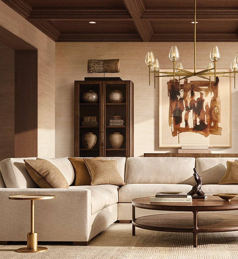
For metals, let an existing fixture or hardware finish guide your choice, then use another finish as an accent if you like the contrast. Brass and matte black, for example, can share a room when the black appears in more than one visible place. There is no need to count every handle or eliminate a third finish already built into the room. Look for a clear dominant finish and a few deliberate connections rather than a strict formula.
Balance Furniture Shapes Without Matching Styles
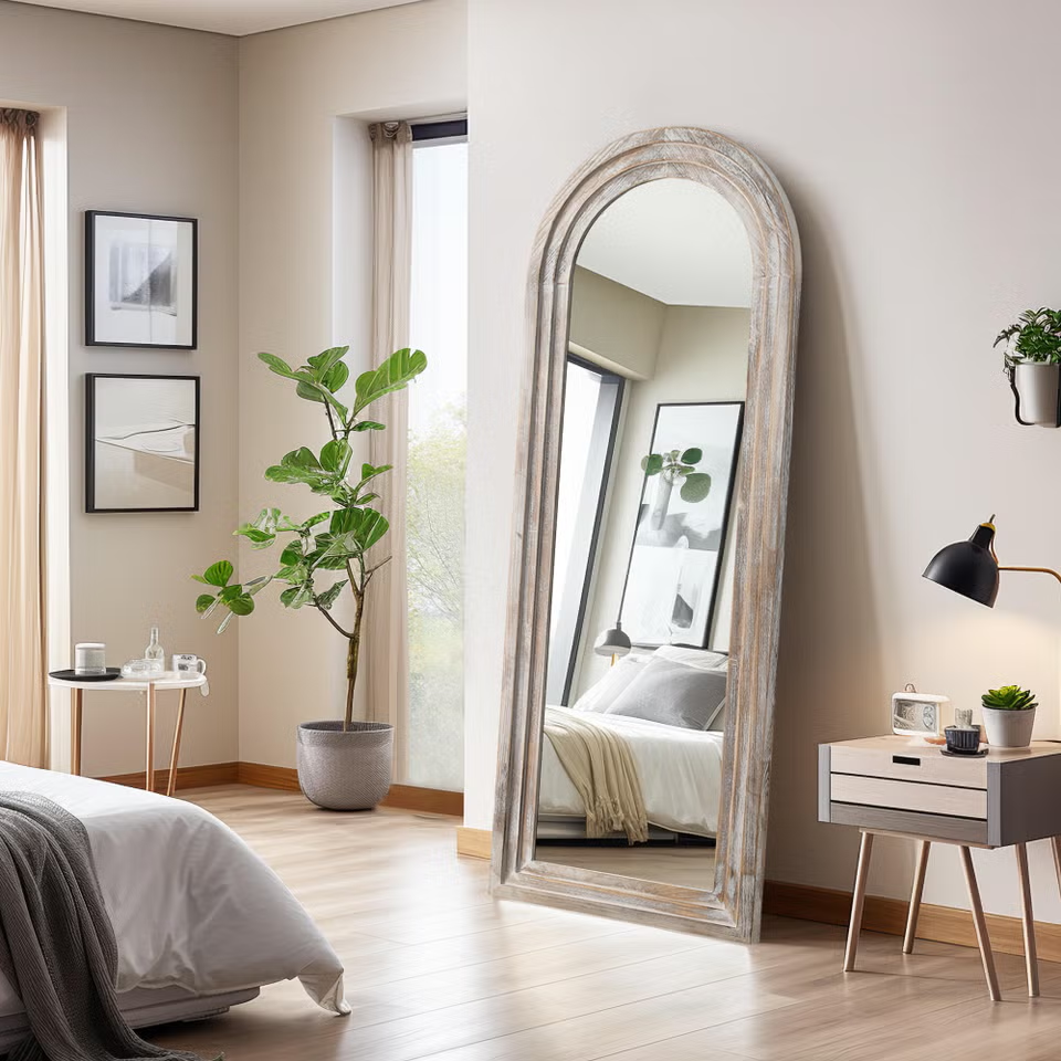
The outline of furniture affects what looks comfortable beside it. If a room is full of square arms, straight table legs, and rectangular frames, a round mirror or curved lamp can soften the view. If most pieces have rounded edges, an angular tray or tailored artwork can provide definition.
Echoing a shape works when you want to reinforce a look. A rectangular mirror above a clean-lined sideboard makes their relationship obvious. Contrasting a shape works when that look has become too repetitive: a rounded vase on the same sideboard adds relief. Neither choice commits you to decorating every item in one style or era.
Stand at the doorway and look at the room as a whole. Which lines repeat? Where does your eye land? A traditional rug can sit near a modern cabinet if they share a color or material cue. The connection should be visible, but it does not have to come from identical silhouettes.
Measure for Rugs, Art, Lamps, and Displays
Before ordering a large accessory, measure the furniture arrangement and mark out the proposed piece. Painter’s tape on the floor can show a rug’s footprint; paper taped to the wall can show an artwork’s size. These checks are more useful than a universal dimension because rooms, furniture, and walking paths differ.
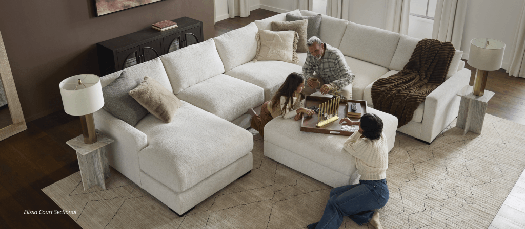
Rugs: Measure the full seating group, not just the coffee table. In a living room, a rug often looks more connected when at least the front legs of the main seating pieces can sit on it. Check that it does not leave an awkward strip of floor between related seats, and keep door swings and walking routes in mind. Under a dining table, pull a chair back as someone would when getting up; the rug should support that movement without its edge catching the chair. If a rug that size will not fit, consider leaving the dining floor bare instead of forcing a small rug beneath the table.
Wall art: Relate artwork to the furniture below it. Hold up a template above the sofa or sideboard and view it from the doorway and from a seat. One substantial piece or a grouping treated as a single shape may feel more balanced than a small frame floating over wide furniture. Check its height from where people normally see it rather than hanging it by an eye-level rule alone.
Lamps: Measure the table and nearby seating before choosing a lamp. The shade should provide useful light without blocking conversation across the room or shining directly into someone’s eyes when seated. A broad base may overwhelm a narrow nightstand even if the lamp’s height seems right. Compare the base, shade, and overall dimensions, then check the fit against your own table measurements.
Tabletop decor: Vary the height and shape of objects, but preserve the surface’s purpose. A coffee table needs room for a drink; a dining centerpiece should allow people to see one another. On a shelf, leave some open space so books and objects remain distinct. One larger object may be more effective than several small pieces that disappear beside substantial furniture.
Layer Texture Before Adding More Pattern
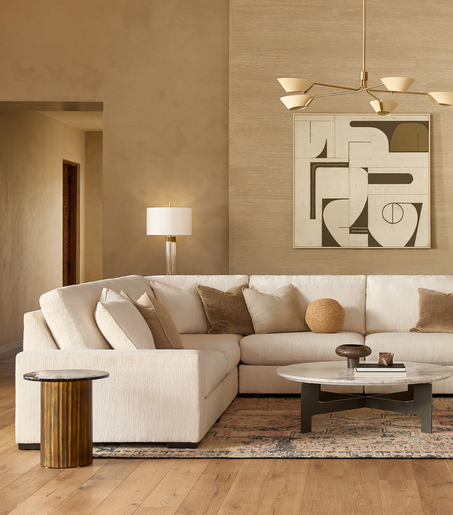
Soft decor gives you a way to change the feel of existing furniture without replacing it. A linen curtain, woven rug, knit throw, and velvet pillow can add depth even when their colors are close. Start with the textiles that occupy the most visual space, then add smaller textures where someone will see or touch them.
Use pillows and throws to connect the sofa or bed to the room palette. For example, a pillow can repeat a color from wall art while its fabric contrasts with smooth upholstery. Curtains can soften a room dominated by wood and metal; a rug can bring warmth to leather seating. Choose materials for how you live, too. Removable, washable pillow covers may be more useful than delicate fabrics in a busy household, while a low-maintenance rug may matter more than a particular weave.
When you add pattern, give each one a distinct role. A patterned rug can be the main visual feature, with quieter pillows that share one of its colors. If the curtains are bold, keep the rug calmer and introduce a smaller-scale print in a throw or cushion. There is no required number of patterns: if the room feels busy from the doorway, remove one and see whether the furniture comes back into focus.
Build the Palette, Test It, Then Buy by Impact
A little planning can prevent a collection of individually appealing objects from pulling in different directions. Follow this sequence before committing to a room refresh:
- Record what must stay. List the anchor, other prominent furniture, flooring, and fixed finishes. Note their undertones and choose a tonal, complementary, or neutral-with-accent direction.
- Gather a few references. Keep photos of your furniture taken in the room alongside samples of a supporting neutral and an accent. Check the samples next to the actual upholstery, wood, and flooring, not just next to one another.
- Test in real lighting. View swatches where the finished decor will sit, in both daylight and your usual evening light. A color that looks balanced online can read very differently beside your furniture. If a large purchase is involved, bring home a sample or mock up its color and size first.
- Prioritize by visual impact. A rug or curtains can change a large portion of the room, so settle their direction before accumulating small accessories. Next consider pillows, art, and lighting according to what the room lacks. Add tabletop objects last, when you can see whether they are needed at all.
This is a purchase order, not an instruction to buy everything. If your existing rug already works, keep it. If poor task lighting is the problem, a lamp may be more useful than new curtains. Pause after each addition and look at the room from several places before choosing the next piece.
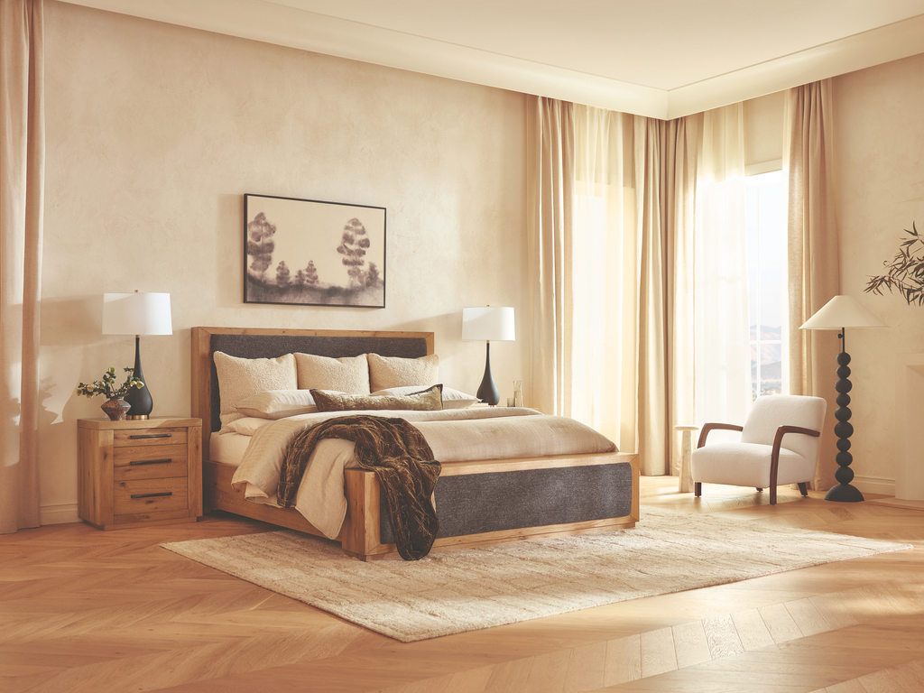
Match the Plan to Your Furniture Starting Point
Use the furniture you have, not an idealized room, as your starting point. These common situations call for different choices:
| Furniture starting point | Decor direction | Watch for |
|---|---|---|
| Neutral upholstery | Bring in texture through a rug, curtains, and pillows. Use one accent color in a few places, checking it against the upholstery’s undertone. | Similar neutrals with no variation in depth or texture; an accent that looks unrelated in the room’s light. |
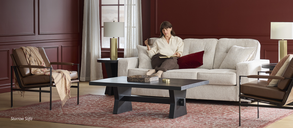
| Colorful upholstery | Let the sofa or chair carry the strongest color. Choose quieter surrounding textiles, then repeat a small amount of its color in art or a rug. | Buying every accessory in the upholstery’s exact shade or adding several competing bold colors. |
| Dark wood furniture | Introduce lighter textiles or wall art for contrast. Check whether the wood leans red, golden, or cool before choosing neighboring colors. | Surrounding substantial dark pieces with equally heavy decor, or assuming every dark wood has the same undertone. |
| Mixed finishes | Use the furniture’s existing wood and metal as palette cues. Echo each in a smaller detail while keeping the color palette focused. | Adding accessories to solve a mismatch that is not there; crowding a room that already has plenty of material variety. |
The table is a starting point, not a set of restrictions. A dark wood table can look good with another dark detail; what matters is whether the room still has enough contrast and open space to feel balanced.
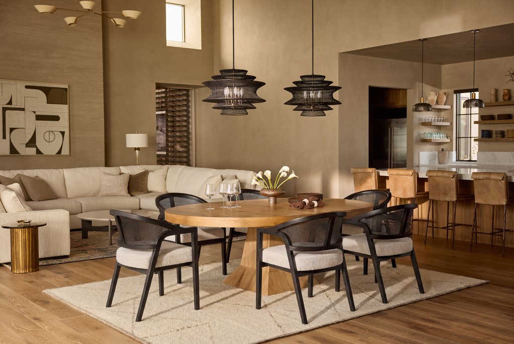
Make the Room Livable, and Take One Small First Step
Decor has to work after it is styled. For homes with children or pets, look for washable covers and rugs you can maintain, check care labels, and choose stable objects for busy surfaces. Keep frequently used tables clear enough to use. If a shelf or console feels crowded, remove its objects and add back only those that serve a purpose, hold meaning, or strengthen the room’s palette.
Before you shop, make one quick pass through the spaces you use most:
- Living room: Does the rug connect the seats? Is the art in proportion to the sofa? Is there useful light near where people read or talk?
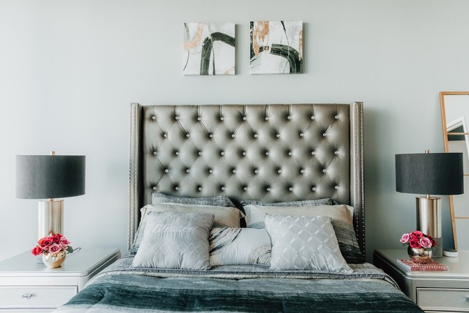
- Bedroom: Do bedding and curtains relate to the bed’s color and shape? Can bedside lamps fit without crowding the nightstands?
- Dining room: Can chairs move freely, and can people see over or around the centerpiece? Do the table and nearby decor share a color or material cue?
- Home office: Is the desk clear enough to work? Does task lighting suit the desk, and is there one visual connection to the furniture elsewhere in the room?
If you are not ready for a larger change, start with one washable pillow cover in the accent color you have tested at home. It is a low-commitment way to see that color directly against your upholstery. If a pillow is not useful in your room, choose a similarly small item from Ashley’s home decor selection that adds the texture or finish you identified. Live with that one addition before deciding what the room needs next.